Zen House
Wellness Center
BRAND TONE:
Calm. Healing. Rejuvenating. Peaceful. Grounding.
Zen House, is a wellness center for those who want to improve their lives through meditation, breathwork, yoga, sauna, and cold plunges. Their goal is to create a welcoming environment that encourages relaxation, rejuvenation, and overall well-being for their clients.
ABOUT:
The chosen color palette of dark teal, black, and grey promotes a sophisticated and calming atmosphere that reflects the values of rejuvenation, grounding, and healing.
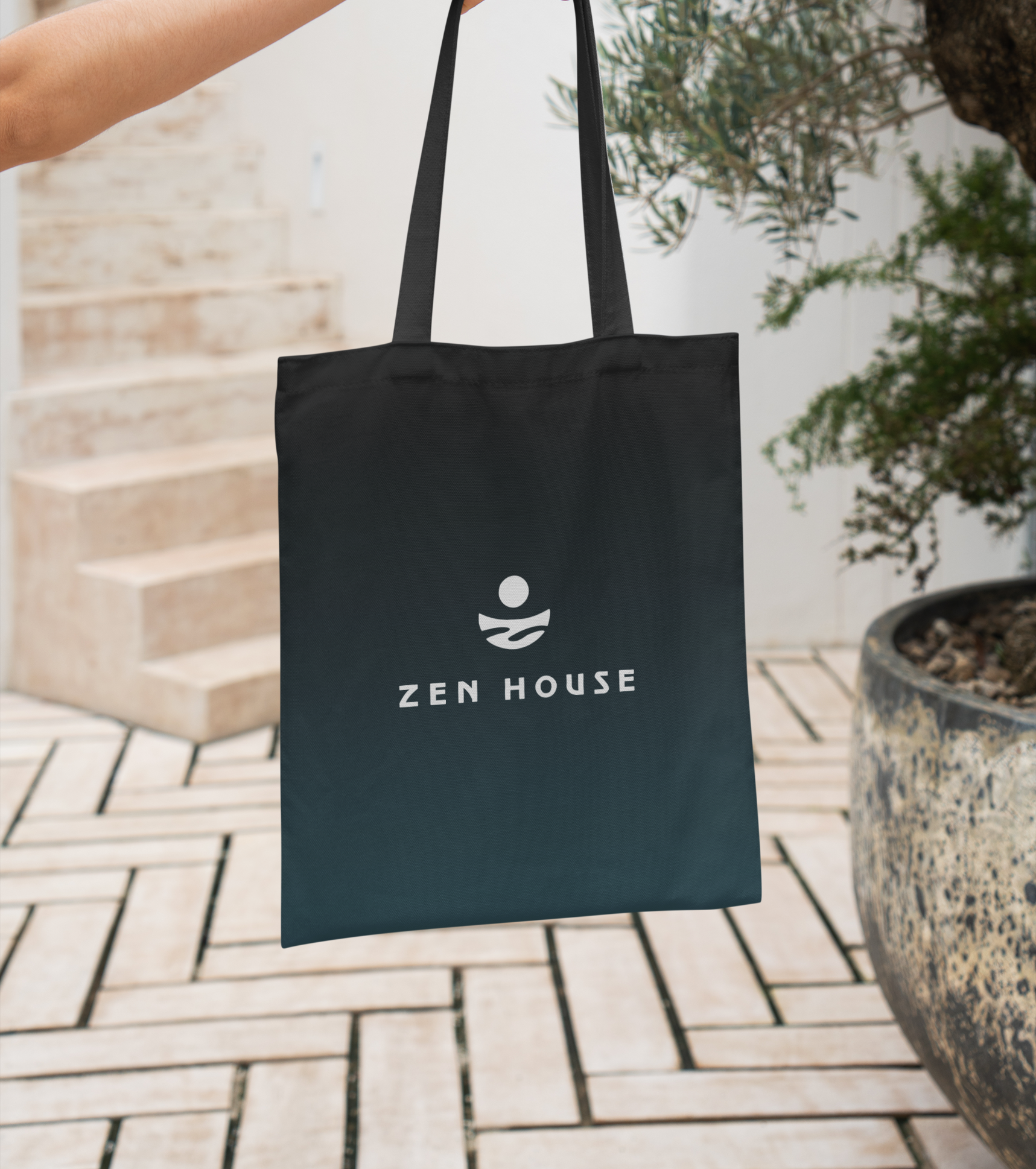
Their logo features a clean and modern style with a round symbol that represents unity and togetherness. The flowing, watery Z is for Zen and the round circle mimics the sun for inner strength. Together the elements of the logo make it visually striking and meaningful.
CREATIVE DIRECTION:
INVESTMENT INCLUDES:
Brand Identity, Website & Social media Templates.