Beanie
Coffee Roasters
BRAND TONE:
Energizing. High Quality. Eco Friendly. Modern.
Beanie’s goal is to be a vibrant and uplifting destination for coffee enthusiasts, providing a positive and high quality experience. They offer an inspiring space while promoting eco-friendly practices and sourcing from locals and sustainable suppliers!
ABOUT:
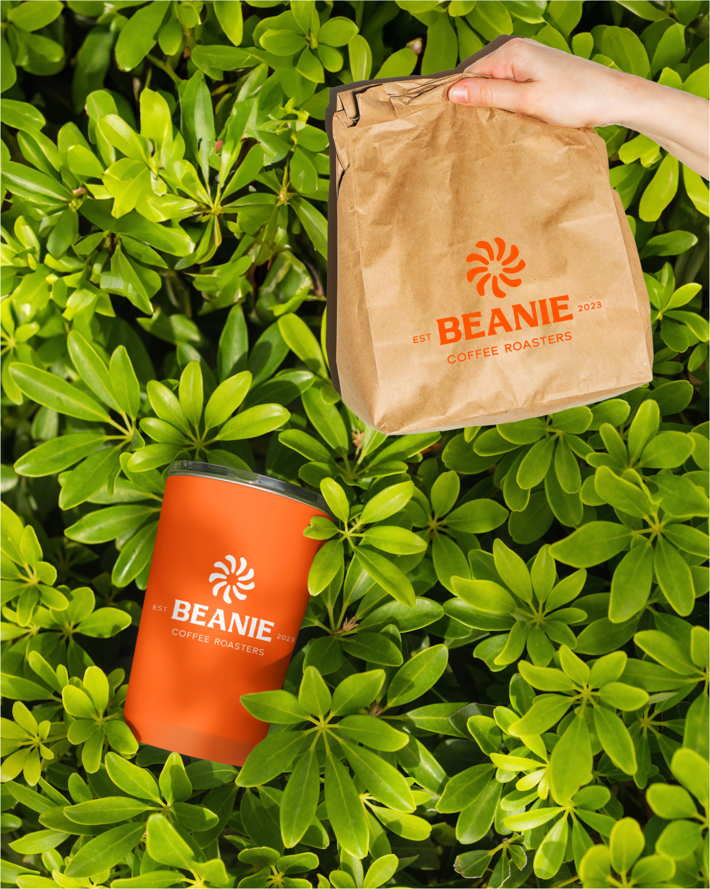
Using bright orange and smooth beige evokes energetic and uplifting state, while also modern. I emphasized organic and ecological design elements in their logos and packaging, and also made sure their brand visually stands out from competitors. The secondary colors are forest green and deep blue, these can be seen used as to differentiate their various blend labels.
Furthermore, Beanie's packaging is made out of recycled paper, and we opted for fewer colors and simplified designs for their coffee bags to promote eco-friendliness.
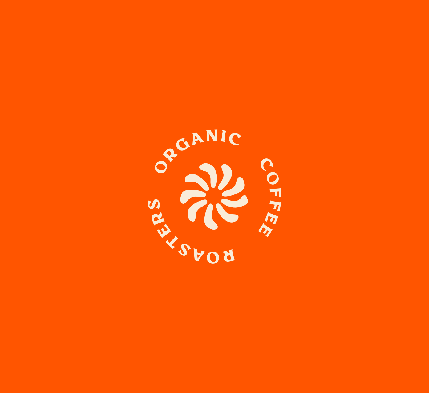
Lastly, the logo is inspired by the actual coffee bean roaster, and acts as a metaphor for the radiating sun's energy, movement, and the image of recycling.
CREATIVE DIRECTION:
INVESTMENT INCLUDES:
Brand Identity, Packaging & Menu


